Freshman Year -- 2D Design Art Dump!
May 29, 2014Hey everyone! I have so much artwork from my freshman year that I'm going to have to break it up into a couple of posts. I'm pursuing a Graphic Design and Illustration major (it's a tough program to get in to and I won't know if I do until next spring) and freshman year was dedicated to the Foundations. These are the basic art classes that everyone in the art department has to take.
First semester I took 2D Design and Drawing I.
My 2D Design course was interesting... We had a textbook to learn the basics of art theory. I had honestly expected to learn more from it, considering that the only art class I had in the past was an informal one at the house of an artist who lives a few neighborhoods away. Being a bookworm pays off, though!
The textbook and lectures fairly well bored me to death, and I'm far too critical of the way that art classes handle critiques. Critiques were three hour long ordeals in which we over-analyzed the movement, balance, repetition, etc, of abstract pieces of art. There was one kid who insisted that every single piece was somehow an abstract rendition of a city, another who said "it's crap" quite a lot, and another who was so nice to everyone that her critiques were more acclamation than critique. To be fair, I did learn a lot about ways of analyzing art and how to describe things that just look "off."
However, I did come up with some pieces I was pretty excited about, and the professor was nice.

It might not look like much, but this drawing was really fun to do. It was one of those zen pieces, if you know what I mean. We had to incorporate patterns around random pieces of construction paper that we cut out. I love pen-work so spending hours doodling in class wasn't really a chore.
There is one thing I have to say about art classes-- it's weird to adjust to making art for someone else and oftentimes making things I really don't care about, yet still putting in all my best effort, work, and creativity.
Thankfully I've had some experience with that during these years of running my Shoppe (minus the "don't care about it" part because I always seem to care about jewelry-making). It's a strange mindset but I'm going to have to get used to it when I go into art and design as a career. There is a HUGE difference between personal art and work art, and I'm learning how to enjoy them both.

By the way, I hate construction paper so much now. We spent the first couple of weeks cutting out random shapes and gluing them in random ways and analyzing them. This is the only remotely interesting piece I made. One of the construction-paper pieces consisted of hand-cutting some perfect squares in three different sizes, and rearranging them until the professor approved it as "aesthetic"-- FOR SIX HOURS.
After this, we got to do some fun work.

One of the many things I've learned about art classes is that you really take out of them what you put in. It's not like math, science, or even (sometimes) the liberal arts, where you gain concrete knowledge as the end goal of the class, and there is a set amount of material to learn.
I've noticed that I get on the nerves of some fellow students because I'm always shooting for the stars, but I do like to challenge myself rather than settling for the bare minimum requirement for our assignments. 2D Design was a very basic course, but I did learn a lot simply from going overkill during the six hours a week I was in class.
The picture above was from an assignment to use perspective points and horizon lines to create a picture that incorporated visual volume. We were also allowed only three colors (of which we could only make tints and shades).
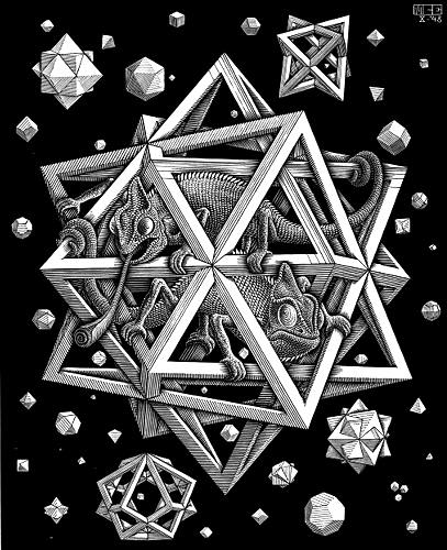
The inspiration came from M.C. Escher's "Polyhedra" (shown at right). Basically I constructed a bunch of basic shapes and had them interlock in visual 3D space. The only thing that I don't like about this piece is that my professor told me that I had to paint each face of the cubes and triangles a solid color-- no shading based on internal shadows. She said this was because it was too advanced for our class and some of the students don't know how to do it without reference photos. "Save it for dedicated painting classes."
I kind of wish that art students were less competitive. I know that competition is a big motivator (for myself included), but there are some people who can't be genuinely happy for another person's talent. I sure know that I have a hard time fighting off jealously for those insanely gifted people in my classes, and I understand the feeling 100%. However, I dislike being apologetic for trying my best at the things I do best.
I kind of wish that art students were less competitive. I know that competition is a big motivator (for myself included), but there are some people who can't be genuinely happy for another person's talent. I sure know that I have a hard time fighting off jealously for those insanely gifted people in my classes, and I understand the feeling 100%. However, I dislike being apologetic for trying my best at the things I do best.
Anyway-- back to art!

The colors in this photograph came out way too orange but I can't seem to Photoshop it into the real-life colors. (Did I really just verb-ify "Photoshop"?).
This was a technique in color-mixing. The piece had to incorporate transparent objects, but every change in color due to overlapping objects had to be done by MIXING the paint colors-- no easy-peasey washes. It took forever.
I couldn't come up with what design to do (abstract work requires too much thinking, darn it!), so I decided to paint a song instead. I don't think I've talked about it much on this blog, but I've recently discovered that I am not crazy. (Surprise! lol!). Ever since I can remember, I've associated colors and shapes (and sometimes textures and personalities) with different things like music, letters, and numbers. It's an actual psychological phenomenon called synesthesia.
Anyway, that is just proof that I am not crazy when I said I wanted to paint a song. I picked a cool one by Mannheim Steamroller-- below is the YouTube video. I painted snippets from the first thirty seconds or so.
(The full Fresh Aire song collection is on youtube here).
I wonder if any of you can listen to the song and see it in the painting, too? The painting is pretty meaningful to me because it's one of the ways I remember the song, but I imagine it's just a normal abstract piece to literally everyone else.

In this painting, we had to start with cutting out a small piece of a design from anything and build an entire painting off of that one little cut out, perfectly matching the colors. If you look closely at the the painting, you can see a small shiny circle smack in the middle of the red and blue in the middle. That's a cut out from a tea container.
Anyway, the design I came up with is kinda-sorta based off of Dancheong (a Korean art form I've blogged about before). Only it morphed into something else altogether.
That's all the interesting work from my 2D design class! Later this week I'll share artwork from my Drawing I class.
____________________
P.S. I have another flash sale going on on my Shoppe right now-- I'm moving everything from Artfire to Etsy, and I'd like to clear out some of my inventory while I make that switch!

This Woodland Elf Jewelry Set is 50% off right now.
 (Note-- this one just sold as I was working on this post. I'm going to keep it in the post, though, because I like Frozen. :) It's a great movie!)
Want to stay in the loop and know every time I have a sale? Follow my Facebook page or Tumblr or Twitter!
Anyway, the design I came up with is kinda-sorta based off of Dancheong (a Korean art form I've blogged about before). Only it morphed into something else altogether.
That's all the interesting work from my 2D design class! Later this week I'll share artwork from my Drawing I class.
____________________
P.S. I have another flash sale going on on my Shoppe right now-- I'm moving everything from Artfire to Etsy, and I'd like to clear out some of my inventory while I make that switch!
This Woodland Elf Jewelry Set is 50% off right now.
Want to stay in the loop and know every time I have a sale? Follow my Facebook page or Tumblr or Twitter!


0 comments