Junior Year Design Dump
February 12, 2018(This is a continuation of the "art dump" for work I made in college. You can see the post about junior year illustration here, or check the blog archive for earlier work).

Junior year was insane.
I've been gathering the images to share in this blog post will sorting and compressing all my school files on an external harddrive. It's strange to go through hundreds of files, representing hundreds of hours of work and a good deal of stress, and realize that there are only a few images per class that are remotely worth sharing.
Since my school has an unusual structure-- students take two years of foundation courses and apply for their specific programs at the end of sophomore year-- junior year had the first true classes in my program. We'd had basic training in how to use the Adobe Creative Suite, but never really applied those skills to larger projects until junior year. It was a year of scrambling to master the tools and techniques needed to execute the larger, conceptual projects. And a year of massive research. Every single project had a visual research PDF; I collected hundreds of images in just a single semester. This was also the year that we started making professional presentations of research, sketches, projects, and revisions, and went through increasingly intense three hour long critiques for every project.
As well, I finished up almost all my gen-eds during Junior year. They were a nice break from studios (for which you are in class 6 hours a week for a 3 credit class) but they made up the time in readings, essays, and exams. Junior year was a heavy, heavy workload.
In the interest of not spending forever on this blog post, the images below are not sorted by class or chronological order. Also, these are only from design classes. I've already written about the illustration class here, and another illustration one will be posted next week.
Let us begin!

 |
| Cut-outs from calligraphy practice scraps, salt and glue drawings, a three literally crocheted out of an old hat, wire sculpture, book sculpture (repurposed two years later for an exhibition; see the video here), embroidery on a leaf, burnt matches, an "eight" made out of ice (the mold was made with cardboard and seramwrap), my synesthetic color/personality "nine" made out of clay, and lights. |

Book cover design! The first of many, and one of my favorite types of projects to do. This project was highly conceptual; we had to distill an entire book down to just a couple of adjectives and illustrate that using physical materials.
If you look at the book covers I've designed in classes over the years, you'll see that when I have freedom to choose the book I inevitably choose some of the weirdest books that I studied in high school (classical liberal arts are always relevant!). Here, it's Chesterton's Man Who Was Thursday: A Nightmare. The story is a sort of 1800's detective novel involving conspiracies, anarchy, and philosophy. The outlined dynamite, vibrant flames, and wobbly typography all reflect the book's themes.
The red background is rough acrylic paint, the flame is chalk pastel on scanned paper cut-outs, and the fuse is a piece of scanned string. The most nightmarish part of this project was the typography. After setting the type in InDesign, I traced it by hand with markers, crumbled the paper, and scanned it back in. I'd never worked like that before, but it gave such an unusual quality to the letters and I felt that it gave the same sense of mirage-y unease that you get when watching light bend around the heat of a flame.


The end result was very satisfying. I cut and bound this prototype by hand.

We weren't provided with photos of the food, so I created illustrations for each page as needed.

These rack cards weren't for a class; I did some volunteering as a designer for the Discovery Center of Springfield. I learned a lot with this volunteer work (which turned into an internship)-- I was working with some outdated style guides hidden in the bowels of an old harddrive, had just learned how to use all the software, and was not working under a designer. Sometimes you learn by being thrown in the deep end!

Here's another project unrelated to any class: a logo and branding work for the fictional insole company, "Fitfoot." I attended a day-long entrepreneurial workshop, Innovate Springfield. We were sorted into teams and tasked with developing a complete business pitch in just a few hours, interspersed with talks from local businesspeople.
This was a great learning experience, but sometimes quite stressful under such a time crunch. I was the first designer to participate, and my teammates didn't know what to do with my skillset. I was able to help with the brainstorming, researching, and overall business plan, but had to advocate for the team to give me time to develop some design work. I made a logo, illustrations of the product, infographics about the business model, a fully branded presentation for our company, and marketing collateral for our presentation table. I think in the end I was able to show how important design can be to a fledgling business. My team was wonderful with the business pitch, and I learned so much from them.

Yay for visual puns! This was the first project in our typography class-- and man, I struggled with Adobe Illustrator. It's so funny thinking back to how difficult these now-straightforward techniques were.

This was the first infographic I ever made, and while it was a blast to work on, I was frustrated by the very specific information I had to cover. This timeline features about twelve different aspects of ocean exploration.
Also, I am now petrified about the quality of these illustrations, and the fact that I showed the Titanic in one piece!

Here's another project from the same class. There are stories about this prompt, and the information I was given and how I was expected to present it for the given demographic. I'm mostly including this piece because I still remember the absolute excitement of understanding how to make detailed vector illustrations. Every one of these illustrations was built completely from scratch.

I have to thank Grandma so much for her help with this family tree (text blurred for some privacy). She has done a lot of research on Ancestry, and I was able to get information on over seven generations on her side of the family! In the process, we discovered that I am very distantly related to a painter, the illegitimate son of European royalty, and a Native American mistress with a very sad story. Also, one of my great-great uncles, a farmer, looked exactly like Matt Damon, so that's cool.

This car dashboard redesign continues the infographic theme. Again, I was working with some very specific project parameters. I enjoy this sort of work, which requires thinking through use cases and safety. I can't get it to embed in my blog, but I did create animations showing this in use.

This is a sample page from a Typography project; we made a full booklet highlighting our program.
Just look at all those excessive hyphens! And even with all that hyphenation, I still wound up with bad rivers and widows! It kills me inside!
But I liked the colors.
I actually like this colorway so much that I got banned from it for an entire semester during my senior year. :)

For this project, we studied stationary design and created a line of collateral for a fictional business. I chose an ostentatious hipster barbershop and named it Occams' Razor, as you do.

In the ongoing saga of junior-year-Shaylynn had no idea how to use Adobe Illustrator, I present "Lazy Anansi."
Due to some miscommunication about the curriculum between professors, our class wound up all over the place with this project.
I enjoyed making the border designs and planning out the illustrations, but let's just talk about how bad these spreads are. Crazy type at a nonsense angle. Rough vector artwork that was not supposed to be rough. Inconsistent line weights.

And worst of all, feathered text boxes with small margins.


During junior year, I had my first experiences with web design. This was another difficult class-- my classmates and I wound up spending massive time on Codecademy in order to learn the basics of coding, and watched endless Lynda tutorials on Dreamweaver and Muse.


Look! You click "design" and the menu changes to calligraphy! Do you know how difficult that was to do?!

I learned enough about coding that at the end of the semester that the professor gave myself and another student, Taylor, a different finals project from the rest of the class. (No doubt this is because Taylor was the one who introduced us to Codecademy and since I sat next to her we always compared notes on HTML and CSS.)
The class above us was working on a senior design project. They created a kiosk design for the Community Blood Center, but didn't have the skillset to code the interface. Taylor and I learned the basics of Javascript and wrote the code for the kiosk in just a couple of weeks. We also advocated for some design changes to make the project more functional.

While many of the projects I made junior year were learning opportunities and not much more, there are still a few that made the cut for my professional portfolio (with edits down the line).
The first is the Camellia project. We were randomly assigned short stories and tasked with creating magazine spreads. We made three spreads for three demographics: Sophisticated, "Hip Teen" (lovely demographic name), and Conservative. My story was Steadfastness: The Camellia.


The second design, for "Hip Teens" was much more of a challenge. At the time, lettering was becoming uber-popular, and I wanted to learn how to do vector lettering since we never covered that in class. My professor gave me the go-ahead, and I dumped many hours into this (very rough) draft:

During preliminary critique, the professor rejected this approach to the piece. He then took on the role of an art director, and gave me specific instructions on what he envisioned for this spread. The final result was:

The ink lettering is supposed to reference Asian art, and the feathered red represents blood. The gore is supposed to appeal to Hip Teens. Though I did fulfill the project parameters successfully, this spread did not make the cut for my actual portfolio.

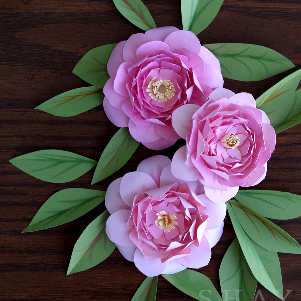
The final piece was my favorite, although stylistically it did not coordinate with "Sophisticated" or "Hip Teen."
I wanted to focus on the eponymous camellia flower itself, but couldn't find any photos that I wanted to use. This pushed me to try other media, and I landed on paper crafting!
<center>
I cut out (with help from my sister on a trip home) dozens of paper petals and glued them together. Then, I had a blast with the photography:


This was a group project with my classmate Tess (she doesn't have a portfolio website right now, so I won't share her last name here).
For this project, we designed advertising and invitations for an exclusive VIP fundraising party for a fictional casino. The design prompt was Dada and/or Bauhaus (art movements very different from the style of art Tess and I usually worked in).

We focused on three designs highlighting the words "Murder," "Mystery," and "Party." We chose to work with Dada-inspired collages.
These posters are actually three-dimensional, designed with several layers of die-cut images layered on top of one another:

 |
| Here's the deconstruction of layers |


This gif shows the pages in action.

And, of course, we had mockups for a social media presence. We built a little website as our presentation for the project if you would like to see a few more of the elements.
That's all for today! I've already shared the illustration work from the first semester of junior year; next week I'll share all the illustrations made in the second semester!


0 comments